While I was doing some research about the history of the web, I realized that Yahoo! has a unique place in being able to judge that culture. Unlike many popular sites from the past, it still exists (even if it is less popular now than its alternatives.) It goes back as far as the internet archive does, meaning that we get a good look into the past. For the purposes of history it is useful that it doesn't have a clean and simple homepage like Google made popular. This allows us to get a sense of how it was used by just looking at the front page. Thus I thought it would be fun to look at snapshots of the homepage taken through the internet archive, and see how things changed year by year.
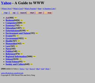
The internet archive only goes back to 1999 for screenshots, so let's start with some pictures of Yahoo! before that that I found here and there. First, from 1994 (taken from Wikipedia):
Nice and basic. It's a directory, so you've got a variety of categories you can look into to find websites. Nothing more and nothing less, though note that there are already over 20,000 sites in the directory, making it more comprehensive than alternatives. For 1995, I found a random image online that was unsourced, so I don't know who or where this comes from (and I guess I can't technically verify that this is from 1995, but it seems plausible):
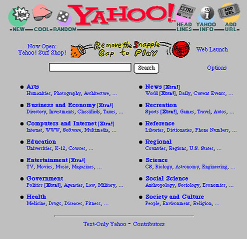
There's a lot to point out here. First, we have some actual organization rather than being a mere list, together with images. (Though note that there is still a text-only mode; after all most people were on dial-up). We have a search. I believe this was a search only of the curated pages and would remain this way for a while, but there was a lot to look through so a search would still be helpful. We have sponsoring by snapple, since Yahoo was now a legitimate business trying to make a profit. And we already have the start of a "start page" type environment, with an option to read news headlines. Note that in the upper right one of the prominently advertised features is to "add URL", that is, they were still actively seeking out input from their users as to what should be shown on Yahoo. The year 1996 looks pretty similar to 1995, so let's skip ahead to 1997:
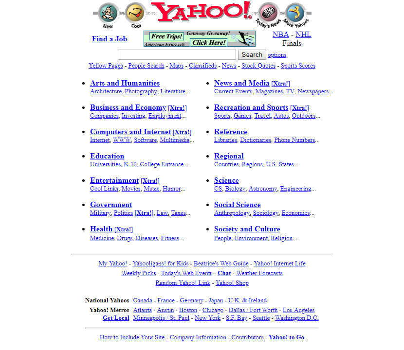
The background changed from gray to white, but I think that's a browser side action. More importantly "add URL" has vanished from the top banner, being replaced by "more Yahoos" (which I think got you to pages like Yahoo Games or the kid version Yahooligans?) The focus is still firmly on the directory structure, but Yahoo is now acting a bit more like a phone book or Newspaper in having yellow pages, classifieds, news, stocks, etc. The option for a text only page is gone, but the page itself is not image heavy. Moving ahead to 1999:
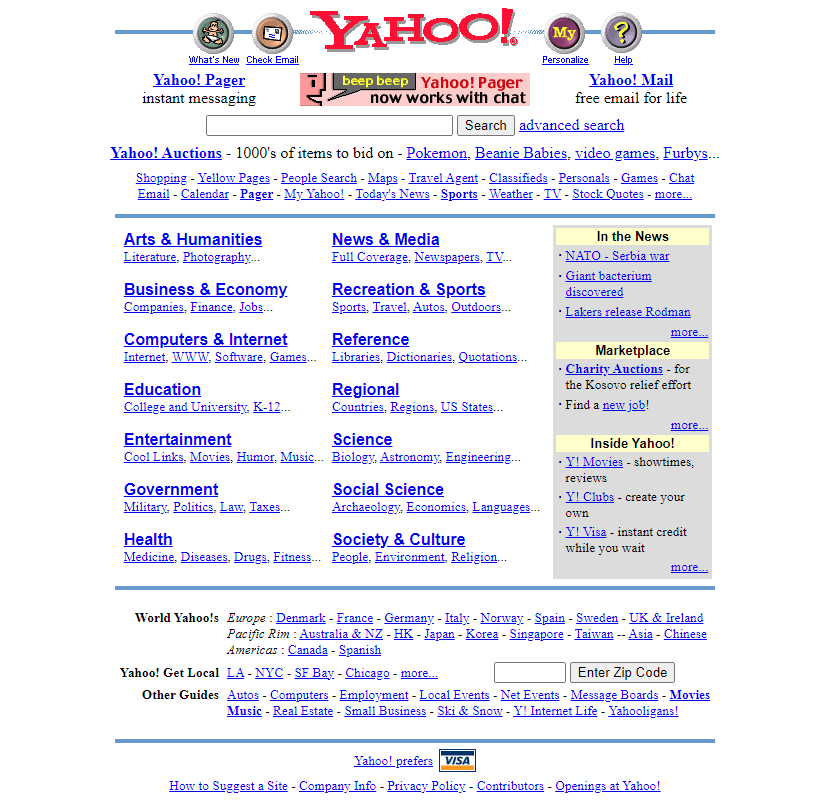
While the core look is the same, there's a lot to unpack here. First note that "cool" has changed into "check e-mail." Yes, we now have an e-mail service through Yahoo, and a very popular one at the time. Before that the average user would probably use whatever was given to him by his ISP (your ISP giving you an e-mail seems like such a foreign concept now.) It says "free e-mail for life" and indeed there might be people from this time who are still using the same e-mail address. I had a Yahoo address, but I abandoned it when it got hacked, so I don't know how they are now. We also have an auction site, which is another hint that Yahoo has went from a simple internet directory to a big business. (The top items being Pokemon and Beanie Babies is a bit of a time capsule in and of itself.) In some ways this is foreshadowing the small corporate internet that would come later though of course in 1999 things weren't nearly as bad as they are now. Yahoo is also putting the news more in your face with a dedicated sidebar. Previously the news was something that was there, but you had to click the relevant link to see. Since I'm just doing the frontpages the other parts of Yahoo aren't obvious, but this is the era where Geocities is in full swing. The site in 2000 and 2001 looked pretty similar, so let's go to 2002:

There's a subtle shift in web design here. It definitely has a Yahoo "look," but we are abandoning any pretense of working as a text only website. The site now stresses search first, but then its features. That is, shopping, geocities, games, chat, job searches, etc. And of course the personals is really stressed. The directory is still there, but further down, and you'd have to scroll down to get to it with most of the resolutions of the time. The categories are no longer in alphabetical order for some reason; they might be sorted by popularity instead. The page has gotten so big that they have to put a second search at the bototm, in case you scroll too far and miss the first search. The next redesign I saw was in late 2004:

We have shifted further towards a colored box design. There isn't even a hint that this would work as a text-only page. Mail is now being very heavily pushed. The major add is for the US election, showing Yahoo's new role as something that can influence culture rather than just catalog it. News, weather and shopping are also prominent. The directory is still there, but you could easily miss it. The sub categories have been removed and as a result it takes up only as much space as the additional services at the bottom of the page, with no design elements drawing the eye to the directory. To be fair, I can't remember ever using a web directory during this time period; everyone was using search engines. I did run through some of it on the Wayback Machine, at least what was archived, and it looks pretty similar to previous versions, though at this point there are so many sites on the directoy that you'd practically need a search to get to any but the most popular sites. So maybe the idea of a directory really was obsolete at this point.
The next few years look pretty similar, and then around 2006 the Wayback machine runs into an issue where Yahoo refuses to serve the main page due to the site interpreting the crawler as an "outdated browser":

Unfortunately this means that I do not have an easy way to see what Yahoo looked like between 2006 and around 2010, when the above error vanishes from the Wayback Machine's archive. Maybe I'll eventually find some hand saved screenshots from back in the day. I suppose that the existence of this alternate page in and of itself says something about the late 00's internet. On the one hand, it shows that sites were now getting pretty busy in terms of the resources used. On the other hand, it shows that they were also getting much more controlling. Previously you would have sites have a text banner saying something like "please use a recent browser for the best experience" or "I tested this on Firefox 2.0, there may be errors on other browsers." Now sites will flat out hide themselves from you if they detect you not using an approved browser, though at least Yahoo still let you use the search (though note, not the directory.) I remember back when I used Pale Moon that I would have to constantly spoof different browser informaiton to access sites, even though they loaded perfectly fine on Pale Moon. In any case, we get the intended start page again starting around 2010:
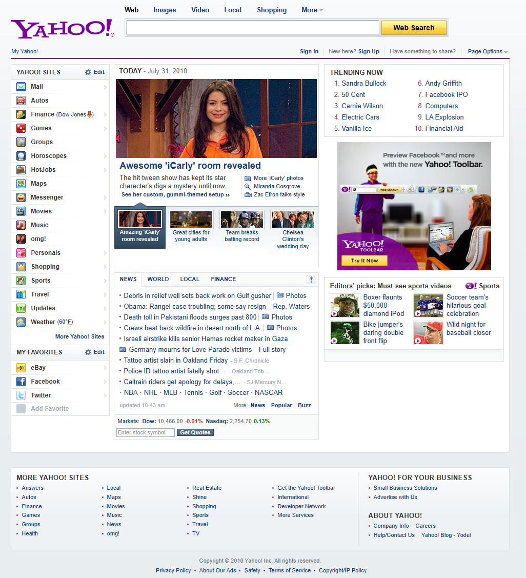
A complete redesign, wiping away any trace of the original 90's aesthetic. The directory has vanished completely. News is not only front and center, but now also comes with images and blurbs rather than just headlines. We have trending searches, which used to be a popular thing to track (and I suppose that simlar things are tracked on social media these days.) Lycos had been doing this for years by this point, but now Yahoo is in on the action. Note that videos are now features. Certainly there had been videos on the internet for a long time; people were trading low quality .AVI files and the like back in the 90's. But by 2010 Youtube, Vimeo, Dailymotion, etc. are around and the idea that you can just sit down and stream videos is part of what people expect for the internet. The next few years have much the same design, but with more and more news articles appearing and more and more videos being added. We get a substantial redesign around 2013:
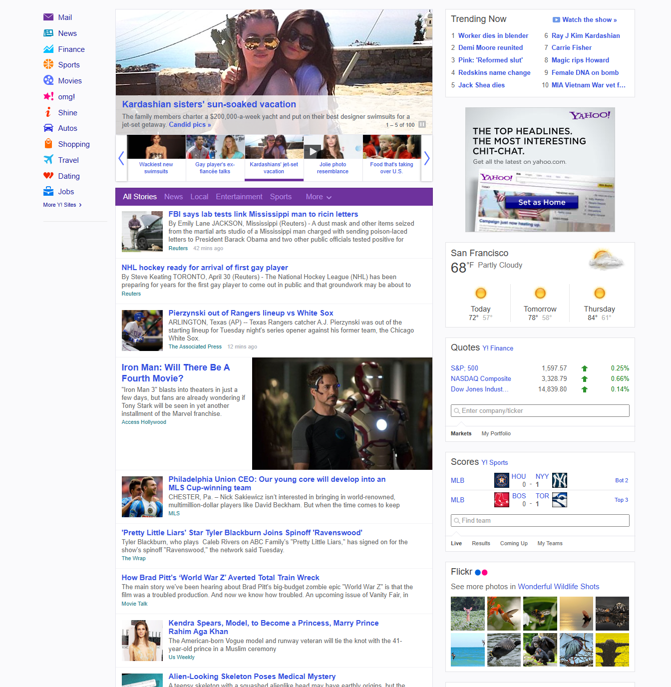
We have now entered the "infinite scroll" era. What you see here is only about half the archived page. I cut it off partially for space reasons and partially to make this at least somewhat navigable (though maybe this would work better as a continuing series.) All you are missing is more news stories. You may notice that there is no search bar but I'm pretty sure that this is an error in the Wayback Machine's capture method where it doesn't show the top bar. Comparing to other images such as in the Web Design archive, there is supposed to be a top banner with Yahoo's logo, a search, and a mail login. So they haven't completely abandoned their original purpose, even if the directory is long gone and the design draws the eyes to endless news and images. I suppose that we are well in the era of smart phones by this point, so the audience has dramatically changed. Rather than being a start page to get you to interesting sites elsewhere, the intention is to draw you in and keep you at the same page. Yahoo had been moving in that direction for a long time, really even adding things like classifieds started the trend, but now we are hitting critical mass. I'll show some more pictures, but honestly this is about where Yahoo ended up. There are some more aesthetic redesigns, including doing things like changing the size of images, but from this point out it's going to be a long string of "news" stories (though as time goes by "clickbait stories" might be more accurate.) It's kind of astonishing to think about how much the page changed from 1995-2013 and how little it's changed in the decade and a half since then.